Post ID: 135


The heart cover? or the cover with the bracelet of bells?
Or one of the new ones?
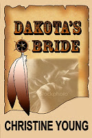
I have a cover for the second release of Dakota’s Bride. I am looking for input and would like to know your opinion. Dakota’s Bride will be released by Rogue Phoenix Press March 1st. Please take the time to vote. All votes will be put in a drawing for a POD of Dakota’s Bride. Be the lucky winner.
16 responses to “”
Leave a Reply
Don’t Hustle Lettyt – Free when you subscribe to my newsletter


Definitely the heart cover 🙂
Thanks Becky. I love the input. Genene is doing such a wonderful job. And it's hard to decide.
They both have appeal. But I think I like the Heart one best. It jumps out more.
I like the colors on the heart cover but I don't like the heart, its too obvious, a little cliche.-Jenee
Maybe we can use the colors fron the heart cover then use the shape from the bells cover (instead of the heart)
Paty, I agree. I think the heart cover, because of the colors catches my attention first. It definitely stands out.
Since I am keeping track and this is the best place. Kim likes the heart cover.
They all look great, but the heart cover just jumps out at me. I think I like that one best.
Thanks Mindy. The heart cover seems to be most liked.
My first instinct is the heart cover — the next choice would be the first one. It's actually all about color (and maybe the clearer focus on the heart helps, too), not really the heart. Now I'll see what everyone else said…I see I'm in good company.
The heart one spoke to me first. It's the one that really caught my attention. I love the colors in it. Great job on covers Genene!
I agree with Jenee about the heart, but I do really like the colors on the bracelet one too.-Ashley
I like the heart one, but I like the cream color on the one above it. All are lovely, Genene does lovely work.
Another reader commented. I can see why you are having a hard time. My favorites are the two on the right side, especially the top right.I will put your name in the drawing.
Alice, I think you hit the nail on the head so to speak. Genene says she can make the hero and heroine clearer in the cover without the heart. We will probably go with that one.
I much prefer the upper left cover. Both the title and the author stand out and I like the suttle and quiet romance of the charaters. The Heart is TOO MUCH.It makes the cover TOO BUSY.Scottish Lass